Thursday 2 April 2009

Ingrid Baars


Ingrid Baars work really captures the female form, while making it interesting and different at the same time. From watching the bond videos, there is often a women stylised, and Ingrid Baars work is something i can take inspiration from in creating my final piece.

Seb Jarnot


i love Seb Jarnot's work, it captures so much motion while being still, it also stylises and simplies down to the basics while still looking cool. I want to try and capture some of this in my own work. I also like the balance of illustration and photography evident in his work, he manages to get the two to work together seamlessly.

David Foldvari


David Foldvari has mastered the use of using only a few colours to striking effect, it really gives a nice style across all his work, and can be used to show anything. I want the bond sequence to be a cohesive whole, and making the whole thing stylistically the same is a no-brainer, using silhouette outlines could be a good path to take.

Benjamin Savignac


I am looking at silhouette style illustrations in keeping with the bond like images from the videos, this is one of my favourite illustrators with a silhouette style to his work, benjamin Savignac. he uses good composition and a mixture of powerful block colours and figures to create striking images, with good use of text throughout. I can picture this style of imagery on a bond intro sequence animated.

Dr No poster


Poster for the very first bond film. Interesting to note it has more of a discription of bond, something that films wouldnt do of a character nowadays, it starts with the same sort of look, with women and block colours that is continued for several posters for bond films after this one. It also mentions the books from which bond is based, obviously not having a bond franchise built up yet except from the books.

another quantum of solace


Another quantum of solace poster, this one i like, it doesnt give much away while still being recognisable, its more creative than a lot of posters out there by using just the silloette and leaves a lot to the imagination. Just the 007 logo is enough to draw people in, and start questioning from the small clues in the poster, such as the dry road. It also has a bit of a bleak washed out feel, in line with what the film was like. a early, rawer bond.

Quantum of solace


Poster for the latest bond film, quantum of solace. The latest posters take on the more traditional layout of poster, more glossily finished composition of photos with large title that people are used to. There isnt much innovation to this poster, more its relying on the bond name to sell the film, as everyone knows what a bond film is. Something i could use, as theoretically just adding the 007 logo would give it a instantly recoginisable bond look, while being able to create more involved graphics.

goldfinger


A poster for goldfinger, really highlighting the sexy women aspect of the bond films. I dont like the use of colour on this one, it doesnt seem to jell well together as a whole. And the repetition of the goldfinger title is just strange. It also doesnt give much to the action part of the bond film, but goldfinger is a more female centred plot that most.

From russia with love


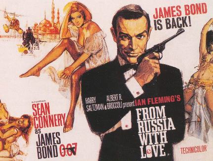
one of the classic early bond posters, it has all the hallmarks of a traditional bond poster, that hasnt changed much over the years, namely woman, guns and the suave spy himself. I like the hand drawn illustrations of the figures, they are realistic yet epic, it also uses an unusual format, landscape instead of portrait. It hints at the themes of the film. I prefer older posters like this that arn't in the glossy style that all film posters seem to use nowadays, it has a lot more character, and if the poster has a nice creative look to it, it hints that the film will be the same. I like the use of golden colours for the majority of the images on the poster, i think it ties it all together.